Fretboard Coffee
Brand Identity • Messaging • Marketing Strategy • 2017
Fretboard Coffee brought HDco on board when they decided to launch their coffee truck.
Fretboard already had a logo, but they needed a brand—with a comprehensive color palette, typography, voice, messaging, and strategy behind it all.
At Hoot Design Co., I expanded the Fretboard visual brand with colors, textures, typography, patterns, and an update to their existing illustrations. Next, I collaborated to produce a comprehensive marketing strategy game plan, which includes a brand voice + messaging guide as well as marketing strategies across platforms.
Work created at Hoot Design Co.
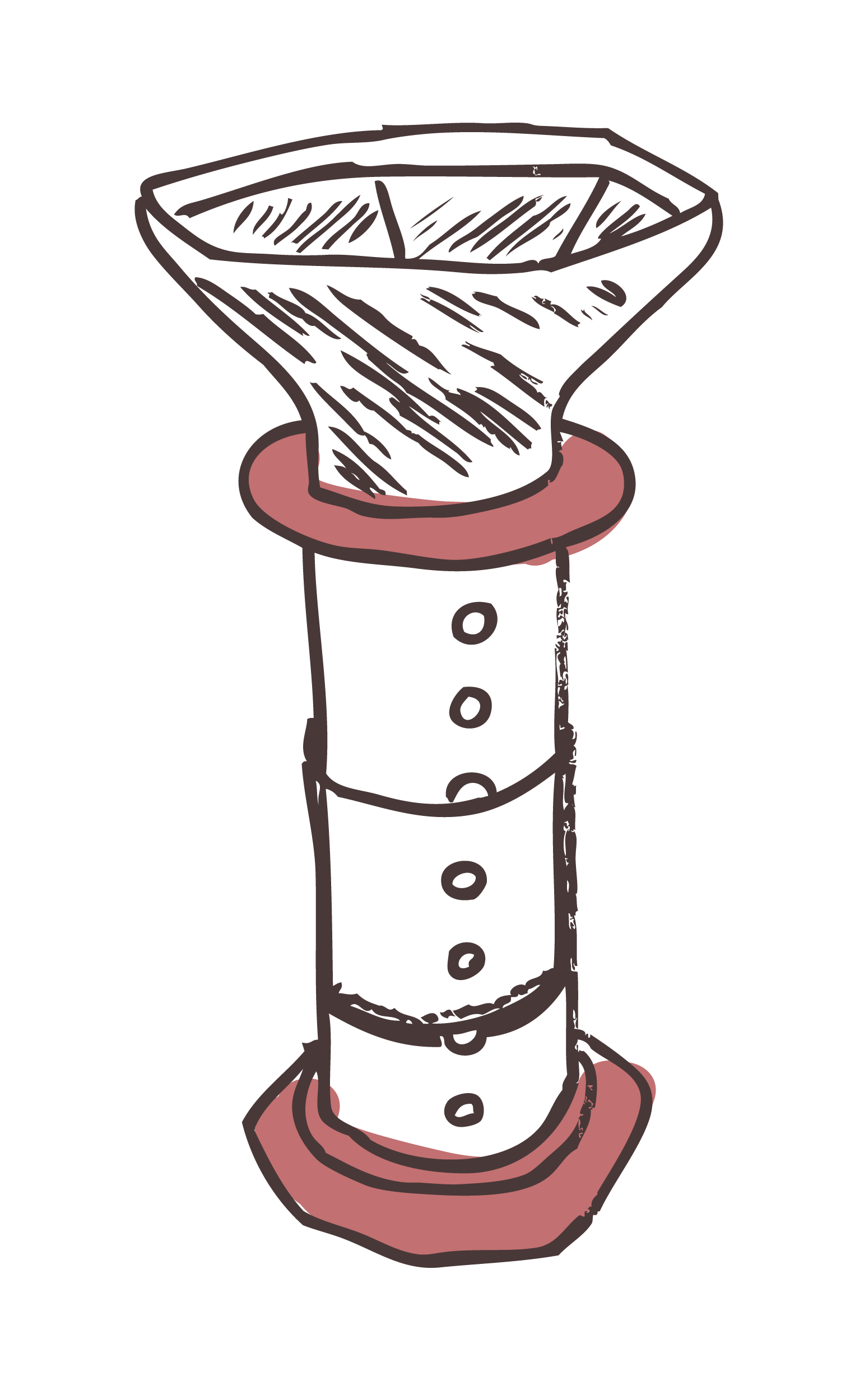
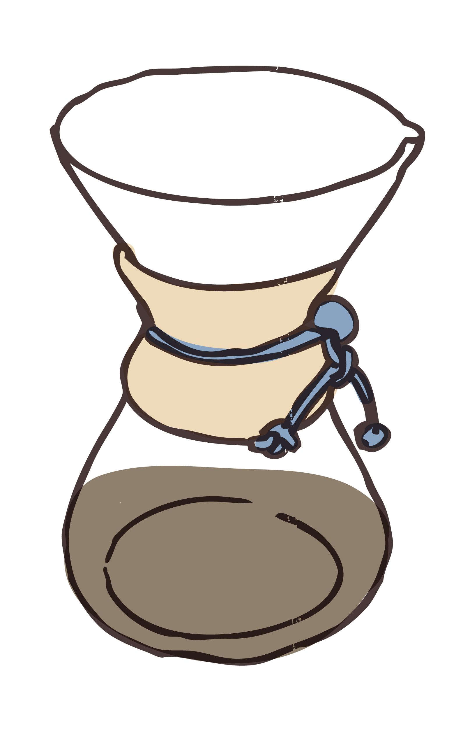
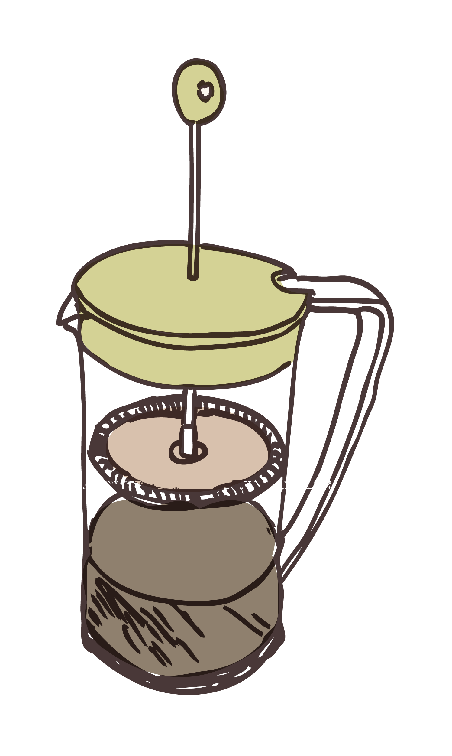
Illustrations: Let's Get Colorful
Fretboard already had fabulous illustrations. I updated them with a colorful coat of paint to reflect their new brand palette.

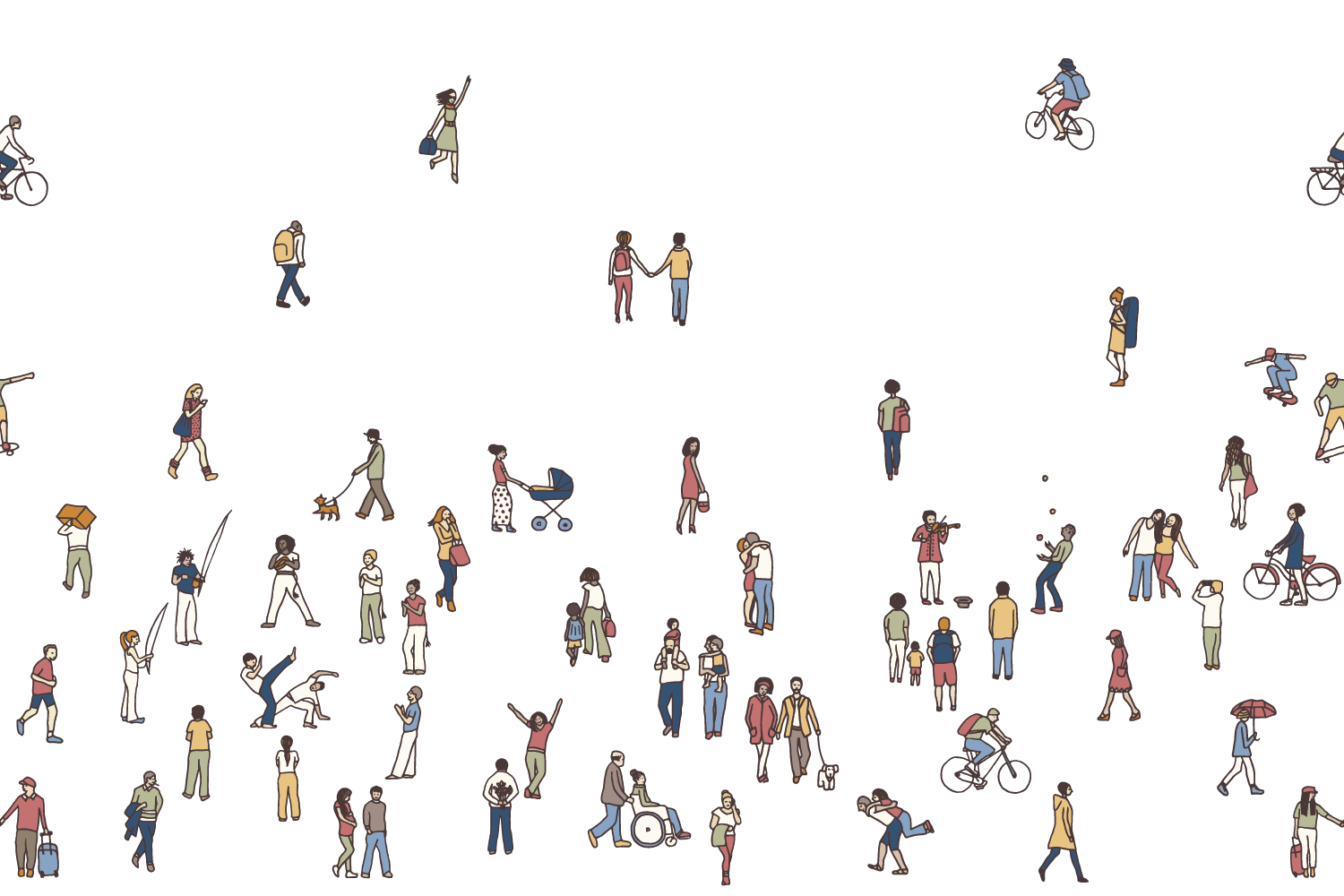
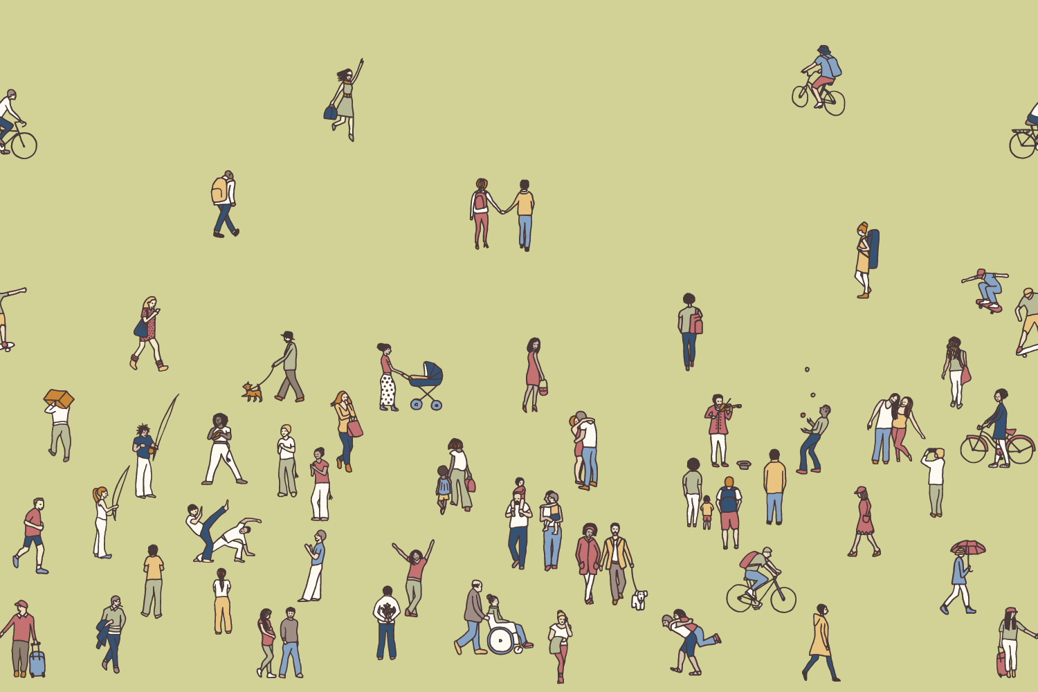
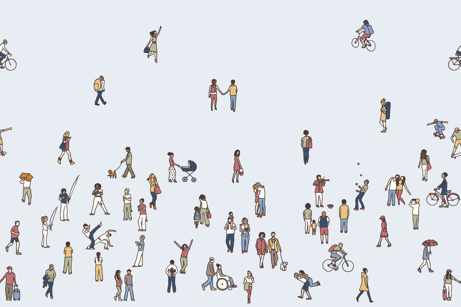
Patterns: Bring it All Together
We selected (and purchased from the artist) a pattern that captures the heart of Fretboard's mission: bringing the neighborhood together. People from all walks of life interact in a delightfully eclectic, detailed scene that could very well happen right around the corner from Fretboard's location.
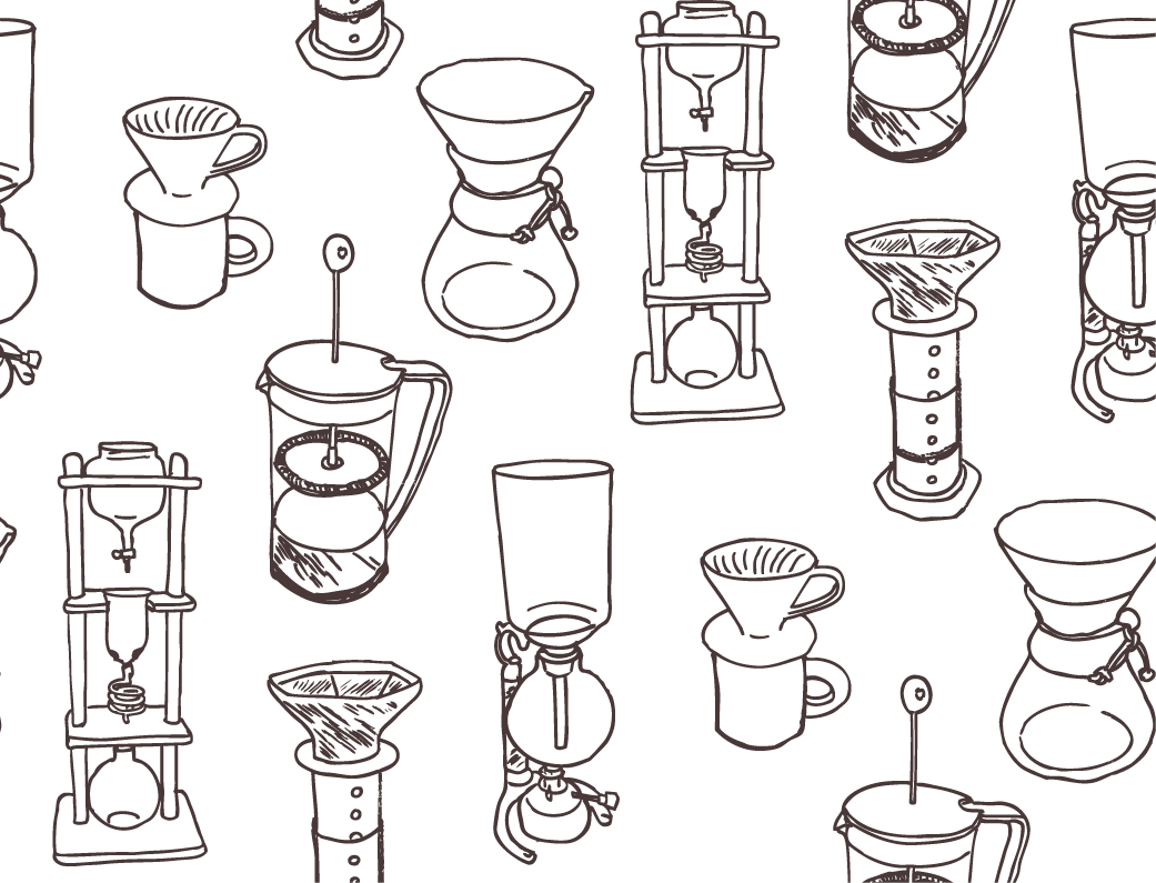
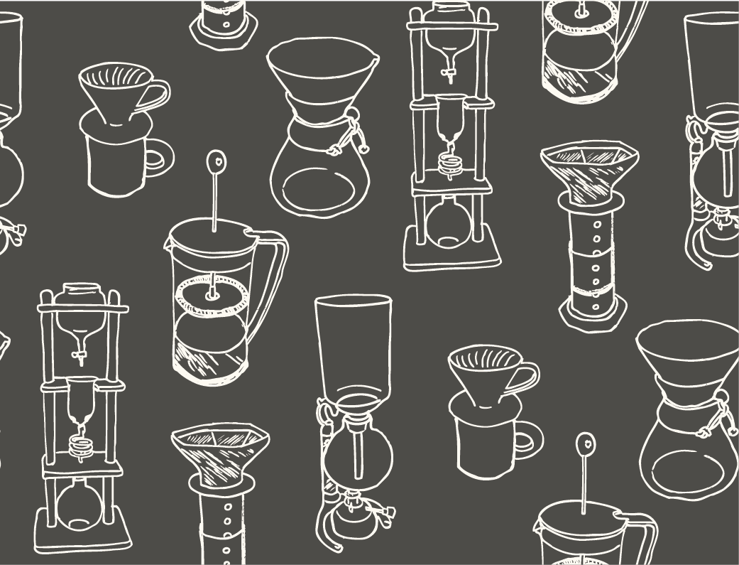
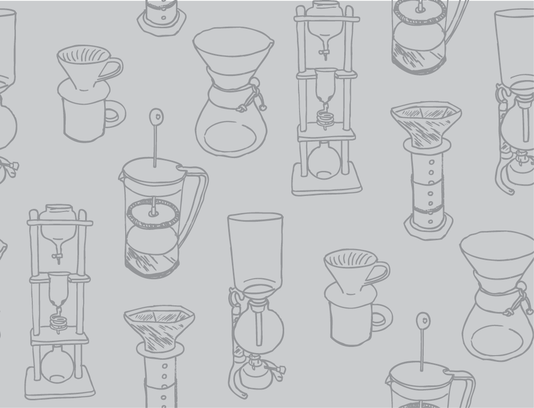
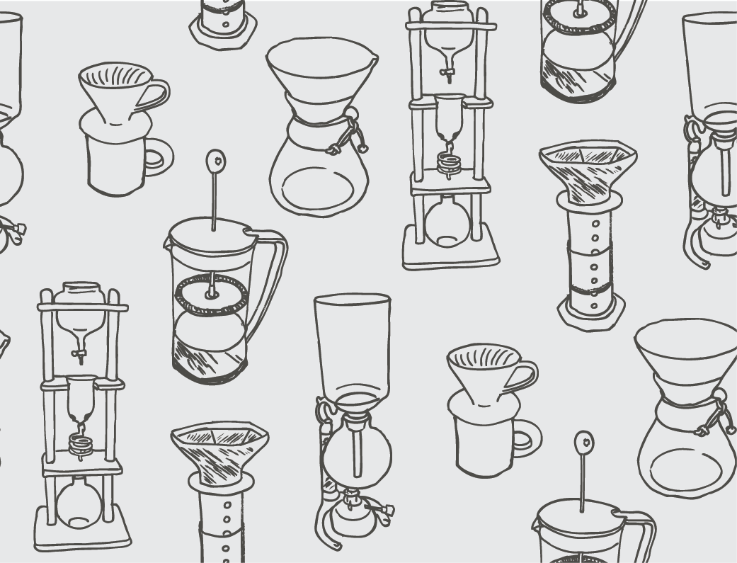
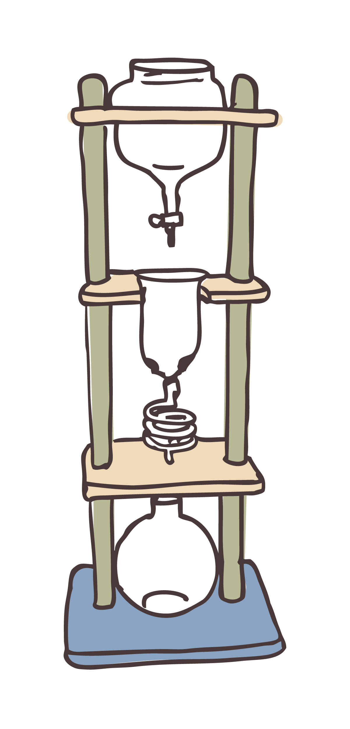
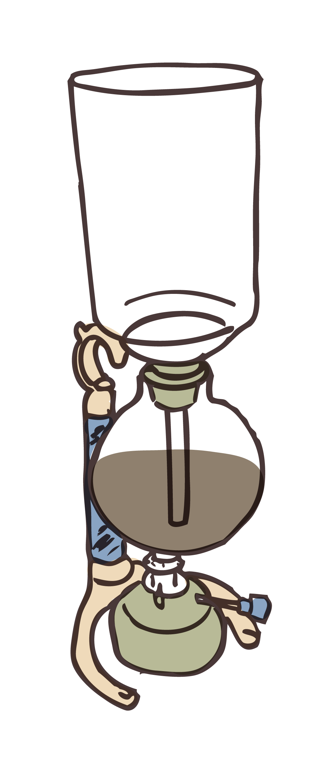
Patterns: What's Brewing
Since a huge part of Fretboard's product is the way they prepare coffee, it was only fitting to create patterns from Fretboard's existing coffee-contraption illustrations.